Graphic Design News

Graphic Design News

Graphic Design News featuring great design, architecture, fashion, graphics and innovation from across the globe.


Xuannao Master Cha

Introducing Xuannao Oriental Daqi Tea enticing Chinese consumers with sparkling tea. Drawing inspiration from Chinese Qigong and the cherished panda, the logo grounds the brand in local culture, bridging any cultural gaps and visually blending tea with bubbles. Chinese virtues like courage, magnanimity, and confidence are metaphorically mirrored in the bubbles of sparkling drinks, encapsulated as Daqi, signifying generosity and inclusivity. Thus, a sparkling tea tailored to the eastern taste buds emerges. In the east, perhaps, sparkling water could be known as Daqi Tea.

Continue reading


Dream Collection

This project is an illustration for GeziWo Park. The whole illustration is divided into three different styles parts. How to unify the styles of the picture is the challenge of project. Taking "Night of Fantastic Animals" as the first part, the moonlight illuminates the mysterious forest, with many birds flying through it. The huge light source breaks the tranquil scene, as if it is the key to a fantasy journey. The second part is "Dream", with many colors covering the whole picture, The mermaid elves are swimming in the blue ocean.

Continue reading


Trip of Tea

The two illustrations combine the two routes of tea transportation in China's history, namely the "Tea Road of Ten Thousand Miles" and the "Maritime Silk Road", using horses as envoys and running through the route of the Ten Thousand Li Tea Road. Every time they arrive in a city, local characteristics are integrated, and the image of horses is also different, mainly reflected in the form of horses and the patterns on their saddles. The pattern on the saddle will change according to the urban characteristics of the destination city.

Continue reading


Remaking Art

The Brand logo combines R and A into a symmetrical design, echoing a reflection in water and embodying the brand's transformation theme. Its interwoven lines reinforce the mirroring effect and are central to the visual, symbolizing integration. The VI system employed uses lines to shape its image across printed materials, products, and spaces, aiming to convey the values of cultural rejuvenation and artistic reimagination. This visual strategy reflects the brand's dedication to both heritage and innovation, with each design element representing a continual renewal in line.

Continue reading


FAFFIN FONT FAMILY

The Faffin font family is a versatile typographic language, offering two distinct styles, Faffin Sans and Faffin Display, designed to be used individually or in tandem, allowing for a seamless blend of contemporary aesthetics. Faffin Sans, inspired by the impartiality of Swiss-type design, this font is a meticulous fusion of contemporary shapes and curves. Faffin Display takes the concept of versatility to the next level as a variable font.

Continue reading


Cosmos Datong

The design team combed through the historical lineage of the ancient city of Datong, and through four sets of thematic illustrations showed the historical features of the city in different periods, which were eventually applied to the product packaging design and derivative materials. The combination of local folk style illustrations and oriental aesthetics of new Chinese style, blended with the traditional color palette of Shanxi shadow art, creates a strong impression of Datong.

Continue reading


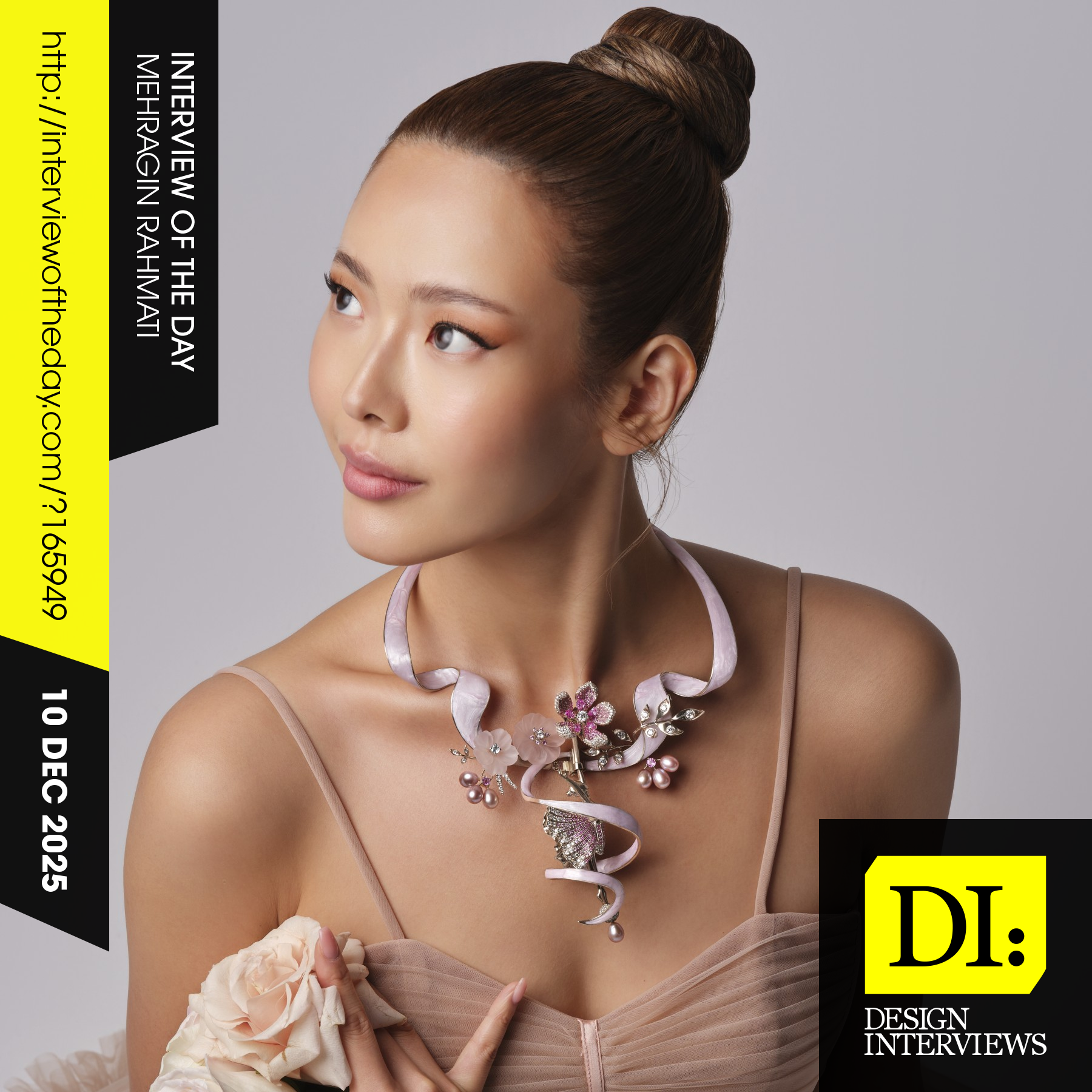
Design interview of the day

Read the latest interviews and conversations on design, creativity and innovation between design journalist and world-famous designers, artists and architects. See latest design projects and award-winning designs by famous designers, artists, architects and innovators. Discover new insights on creativity, innovation, arts, design and architecture. Learn about design processes of great designers.

Continue reading