Graphic Design News

Graphic Design News

Graphic Design News featuring great design, architecture, fashion, graphics and innovation from across the globe.


Cargo Club

Cargo Club is one of the most well-known night clubs in Beijing. It is practically a fusion of Chinese traditional music and pop music. After seven years in operation, Cargo Club had its grand comeback recently, and totally rebranded its identity. We pioneered a completely new brand image. As an entity, the logo looks like a five-pointed star, which is the very symbol of Beijing hard rock. From another point of view, the black/white light resonates with traditional Chinese painting, whereas the colored one indicates Western fashion.

Continue reading
 

Tin Man Filling Station

Logo, brand and merchandise are all inspired by the uniqueness of the region. A first of its kind in the region, Tin Man only sells regional (Texas) beer. Growlers designs change often to add value to the brand. Inspired by the uniqueness of the region and the industrial interior design, each detail of the brand was thought out. Included in the brand is a special edition army growler to honor Ft. Bliss, the Army's second-largest installation, behind the adjacent White Sands Missile Range.

Continue reading


Artificial Realities

Artificial Realities, an exhibition of established and emerging artists, marks the 25th year since the inauguration of the East Wing Biennial. The exhibition identity, commissioned by the Courtauld Institute of Art (London) aimed to capture the essence of the artists exhibiting as well as the surroundings in which it was set. The identity graphically utilises the architectural elements of Somerset House merging with intricate graphic grids to create intrigue and uncertainty; this combined with clever use of typography and simple, yet bold colour scheme help evoke a strong exhibition identity.

Continue reading


Yanolja

Yanolja is Seoul based no.1 travel information platform which means “Hey, Let’s play” in Korean language. The logotype is designed with san-serif font in order to express simple, practical impression. By using lower case letters it can deliver a playful and rhythmic image compared to applying bold upper case. The space between each letters is revised exquisitely to avoid optical illusion and it increased legibility even in small size of logotype. We carefully picked vivid and bright neon colors and used complementary combinations to deliver extremely fun and popping images.

Continue reading


Royal North Shore Hospital Sydney

Solving the Royal North Shore Hospital's wayfinding was not just about designing ‘better’ signs. Legibility, colour and graphics may be the necessary physical tools for a sign but it was the comprehension of their meaning that was important and how this was organised into a cognitive pattern of sign types. Clarity and directness of the wayfinding system is enhanced and enlivened by the use of colour utilised at each lift core as a wayfinding tool to correspond with vertical circulation. Visitors felt comfortable in their spatial environment, and were easily oriented and logically informed.

Continue reading


Insitu Festival

Insitu is a "site specific" dance festival, showing dance pieces created in relation to a specific site. Therefore the visual identity plays with dimensions in a typographic concept that puts words in a space, relating them to their surroundings. The typographic concept is versatile and flexible, and is being used in various ways across many medias. This gives the festival a recognisable, yet variating visual expression.

Continue reading


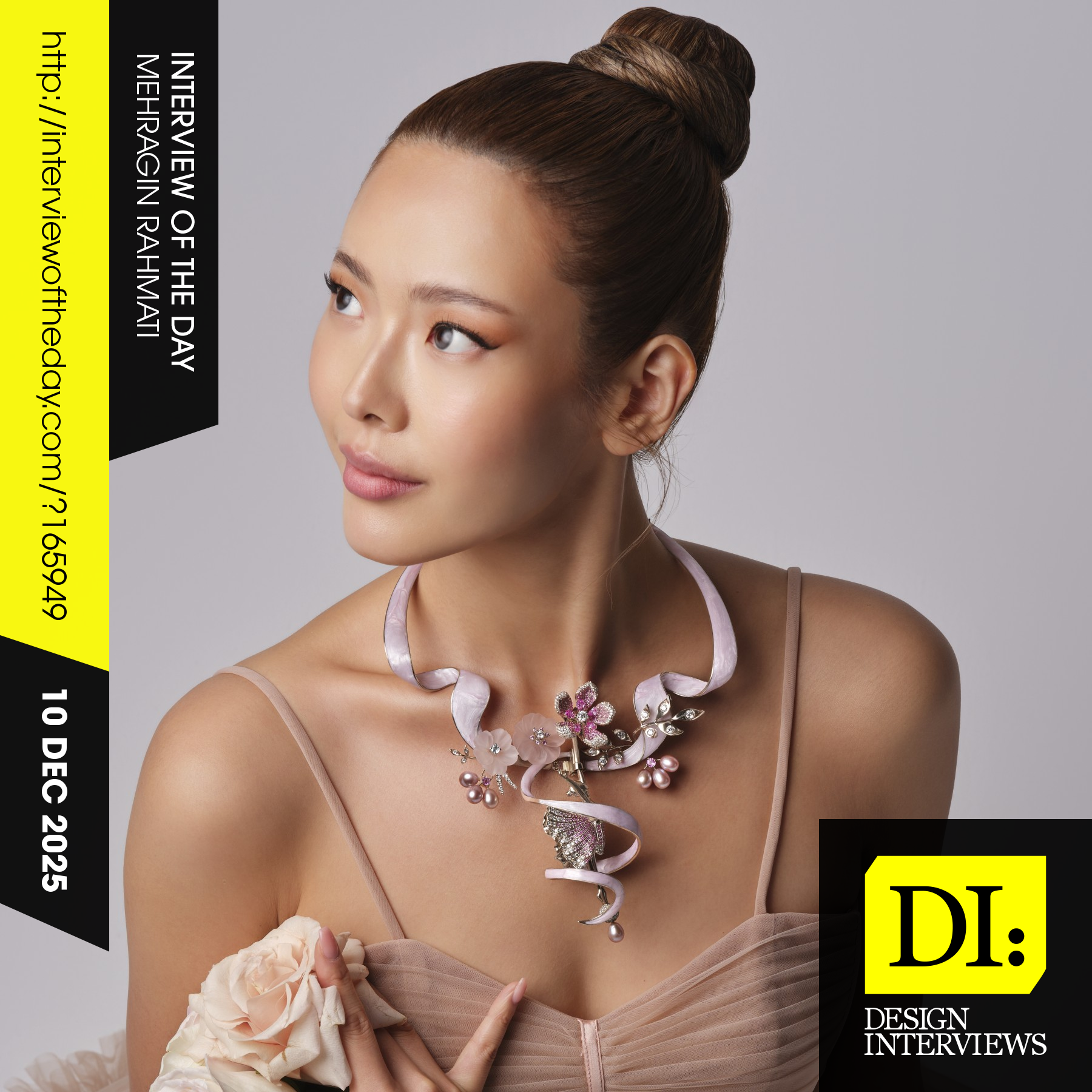
Design interview of the day

Read the latest interviews and conversations on design, creativity and innovation between design journalist and world-famous designers, artists and architects. See latest design projects and award-winning designs by famous designers, artists, architects and innovators. Discover new insights on creativity, innovation, arts, design and architecture. Learn about design processes of great designers.

Continue reading